The Making of a Colorway: How Keycap Sets Go From Mood Board to Group Buy
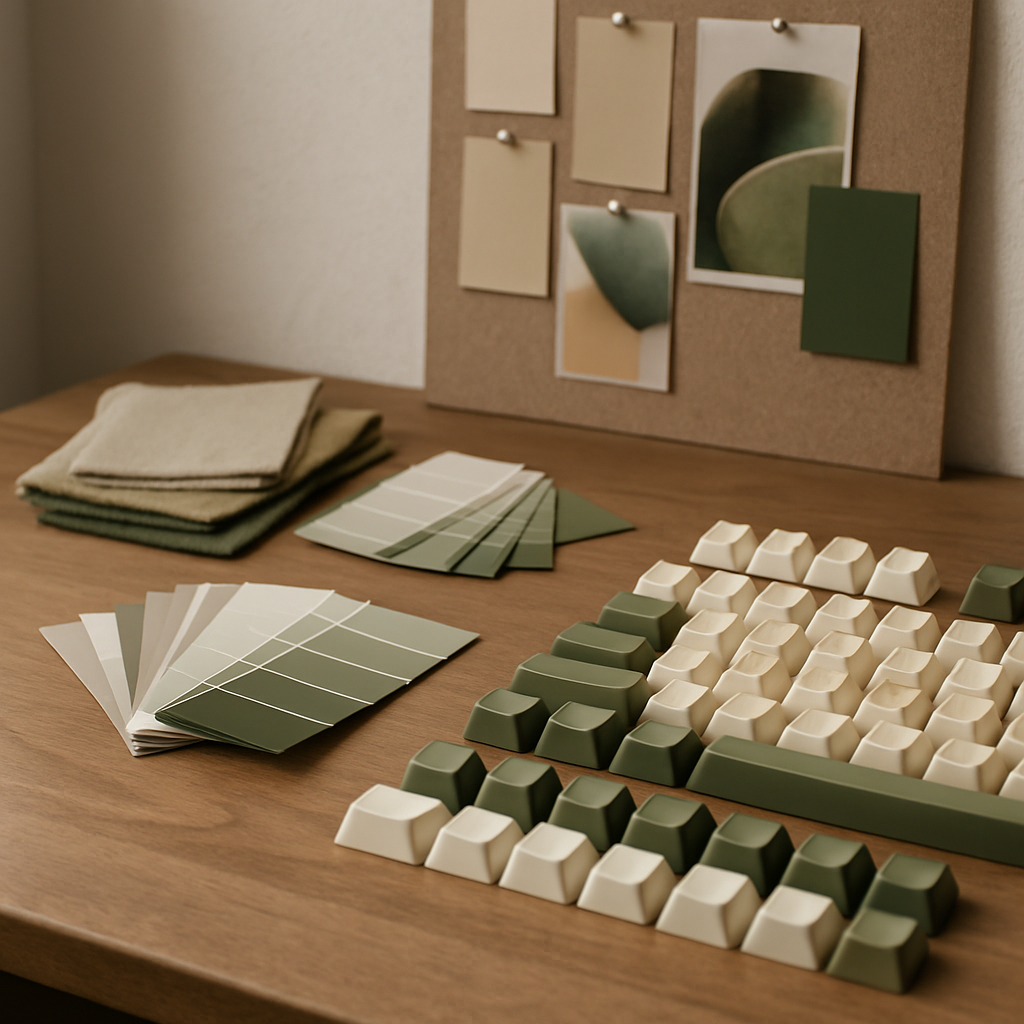
Every beloved keycap set — the olives and creams, the retro greys with a single red Escape, the deep-sea blues with glow-in-the-dark legends — began the same way: as a feeling someone wanted to type on. Colorway design is the keyboard hobby's most visible art form, and yet the process behind it remains mysterious to most of the people who buy the results. Between the first mood board and the day a set lands on desks lies a long, surprisingly rigorous craft.
It Starts With a Story, Not a Palette
Ask successful set designers where a colorway begins and few will say "with colours." They begin with a reference — a memory, a place, an object with emotional charge. A grandfather's radio. The dashboard of an 80s hatchback. Moss on a shrine roof. A particular hour of light in a particular city. The strongest sets in the hobby's history are the ones whose palettes feel inevitable once you know the story, because every hue was pulled from a coherent source rather than assembled from what looked nice.
This narrative-first approach explains why the community responds to some sets and shrugs at others. A technically pleasant palette with no anchor reads as generic. A palette that transports you somewhere earns a waitlist.
The Discipline of Three Roles
A keycap colorway is not a painting; it is a system with jobs to do. Designers typically think in three roles. Alphas — the letters and numbers you stare at most — need a base and legend combination that stays comfortable for eight-hour days, which usually means restrained contrast and low saturation. Modifiers frame the alphas and carry more of the theme's colour. Accents — Escape, Enter, sometimes arrows — are where the palette is allowed to sing.
The classic beginner error is making everything an accent. Veteran designers talk about "typeability": the discipline of keeping the core of the set calm so the accents mean something. The best colorways feel bold in photographs and quiet in use, which is a harder trick than it sounds.
Fighting the Materials
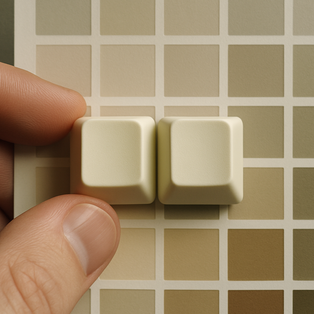
Then reality intervenes, because colour on a screen is not colour in plastic. Designers work with standardised colour systems to communicate targets to manufacturers, but every material shifts the result. ABS and PBT plastics take dye differently. Doubleshot legends — where the legend is a second piece of plastic moulded through the cap — constrain which colour pairs are physically manufacturable. Dye-sublimation, which prints dye into the cap's surface, cannot produce legends lighter than the base material, quietly forbidding entire palette directions.
Sample rounds exist to negotiate with these constraints. Manufacturers ship physical colour chips and test caps; designers compare them against references under multiple light sources, because a beige that glows warmly under a desk lamp can die under office fluorescents. Two or three correction rounds are normal. Sets have been delayed months over one stubborn green.
Renders, Interest Checks and the Court of Public Opinion
Before a set becomes real, it faces the community. The interest check — renders of the proposed set posted to forums and Discord servers — is part market research, part trial by fire. Feedback arrives instantly and bluntly: the accent clashes, the legends are illegible, this looks like three existing sets wearing a coat. Designers who survive the process describe it as the most valuable and most bruising stage.
Renders themselves have become a craft-within-the-craft, with realistic lighting and materials that set expectations dangerously well. The honest designers pair beautiful renders with physical sample photos as soon as they exist, because the gap between render and plastic is where trust is won or lost.
Why It Matters Beyond the Desk
It is easy to dismiss keycap colorways as consumerism with extra steps, but the design process rewards attention. This is a community that has collectively taught itself colour theory, material science, manufacturing tolerances and product storytelling — largely through hobbyists mentoring hobbyists. Many working designers credit a keycap project as the thing that taught them how ideas survive contact with production.
And for the rest of us, the takeaway is a better eye. Once you understand why an alpha colour must be quiet, why an accent earns its place, why a palette needs a story, you start seeing those principles everywhere — in book covers, in kitchens, in train liveries. A good colorway is a small education in design, sold thirty grams of plastic at a time, and typed on every day by someone who may never realise how much deliberation sits under their fingertips.